

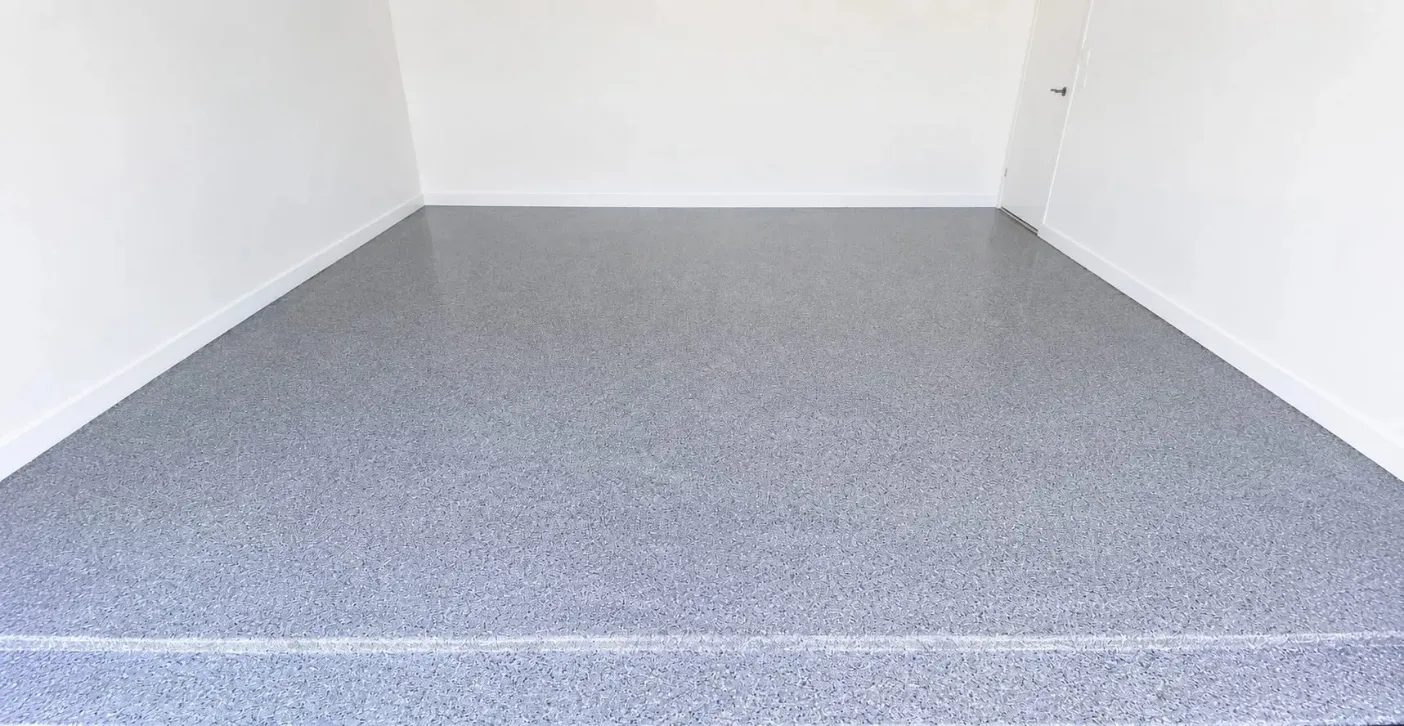
Choosing decorative chips feels like picking paint, yet the stakes are higher because the floor will live with that choice for a decade. A tiny sample card can mislead, and a trendy blend can age badly. Flake epoxy flooring rewards buyers who think beyond the swatch and consider light, dirt, and daily wear. This guide explains how to read a blend before you commit.
Why Small Samples Mislead
A palm-sized sample shows chips at close range, but a whole floor is seen from standing height. At that distance, tiny contrasts blur together and the overall tone shifts. Dark flecks in a light blend may fade into a general grey.
Ask to see a larger board, or better, a finished floor with the same blend. Photographs help, though screens distort colour. Visit a completed project if possible, and look at it in daylight and under artificial light.
Chip Size and Visual Texture
Flake size changes the personality of the surface. Small chips create a fine, granite-like speckle that looks calm and orderly. Larger chips produce a bolder, confetti effect with more depth and movement.
Size also affects cleaning. Smaller flakes sit flatter under the topcoat, which gives a smoother feel. Larger ones may leave slight texture that grips well but holds a little more grit. Match the size to how the space is used.
Contrast, Dirt, and Footprints
High contrast hides dust and scuffs, because the eye is busy with pattern. A blend with similar tones looks elegant but reveals dirt more easily, particularly in light shades. Think about how often you plan to clean.
Mid-tone blends with a few darker and lighter accents are the practical sweet spot. They disguise tire marks, salt, and crumbs while staying neutral enough to suit changing tastes. Extreme colours are more likely to date quickly.
Matching Surroundings
Look at walls, cabinets, doors, and vehicles that will share the room. Warm walls pair well with tan and brown blends, while cool grey spaces suit blue-grey and charcoal chips. Clashing undertones are the most common regret.
Consider the light source too. North-facing rooms feel cooler, so slightly warmer flakes balance them. Bright, sunny spaces can handle deeper tones without feeling heavy. Test samples against actual surfaces before deciding.
Coverage Levels and Feel
Full broadcast buries the base colour completely, creating a dense, durable, textured surface. Partial broadcast lets the underlying colour show through for a lighter look. Each option changes grip and maintenance.
Commercial spaces often prefer full coverage for wear resistance. Homes may choose lighter coverage for a cleaner appearance. Discuss slip requirements, since heavier broadcast generally provides more traction in wet areas.
Industrial and Heavy-Duty Spaces
Flake systems are not only decorative. Warehouse floor coating projects often use chips to hide forklift marks and add subtle texture, while topcoats provide chemical and abrasion resistance. Neutral blends keep large areas looking tidy.
Colour zoning can add safety value. Using a different blend in walkways or loading bays creates visual boundaries without extra paint. It is a practical way to organize traffic while keeping the floor attractive.
Topcoat Choices and Aging
The clear layer over the chips determines how the floor ages. Urethane and polyaspartic topcoats resist scratches and keep chips locked in. Sunlight can yellow some clear coats, so UV-stable options suit bright spaces.
Gloss level matters as well. High gloss highlights depth but shows marks, while satin hides wear and reduces glare. Ask what sheen is standard and whether alternatives are available before the final coat goes down.
Conclusion
A blend that lasts balances chip size, contrast, surrounding colours, coverage, and topcoat. Test larger samples, think about dirt and light, and choose tones that suit the room rather than a passing trend. Careful selection pays off every day the floor is in use.
To see options and talk through your project, visit quickfxepoxy.ca and speak with the team about the finish that fits your space.